At first I didn’t take
ppp seriously enough, but now after thinking and working a lot more this term,
it has really helped. It has allowed to reflect on my work so far and see how
much my lifestyle and design has changed. I have grown a lot fonder of the
module and now understand its importance. Making me review my year as well as
improving my presentation skills and how I present myself as a brand and as a professional.
I now also take into consideration how important it is to run my own personal
projects to enthuse me and to inform my course design. It has made me look at
how I spread my work load and time, looking back it will defiantly impact the
approach I take to the course next year. I have found the guest speakers and trips
out of the uni very useful, its broadened my aspect on design. I hope more of
this happens throughout my degree and trips like the one to Barcelona can
happen again. Next year I will consider my lifestyle outside of uni more, in
terms of eating and spending habits. I say this as I feel like they effect my
mind frame and effect my productivity.
f-silliton1619-ppp
Thursday 30 March 2017
Barcelona Design Museum
Whilst in Barcelona I visited
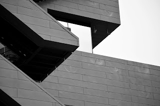
the design museum. Before even entering the building I already had appreciation
for its architecture. I spent time photographing the exterior. Luckily we went
at a time in which the museum had a graphic design print exhibition going on. I
found this very interesting, seeing print from a wide time period and range of
styles. I dint find much of the other work on different floors related to
graphics. Yet there was a product design focused floor which I thoroughly
enjoyed, as it’s a subject I took for a level and something I haven’t visited
in a long time.
Wednesday 29 March 2017
Studio brief 2: self branding
| This studio brief was to design, develop and produce self branding that effectively communicates and promotes me as an individual, designer and learner.
To start this project, I needed to think about concept and how I wanted to be portrayed.
I had three key ideas all playing with my name as a pun.
After this brainstorm I
was sure I wanted to run with my first idea of using my name
Finn S as a pun
for finesse. Finesse definition being: impressive delicacy and
skill. I
think this fits me really well and I have always joked around with the
pun anyway, so
it was fitting.
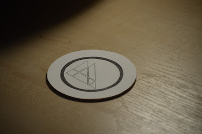
My logo is made simply
from using triangles, being the strongest shape to show reliability
and rigidity.
The triangles create an F, my first initial. This is encased in a circle
creating
more of a logo feel and not just a stylised letter form. Each of the
shapes to makeup the
F is a different colour selected from my favourite
colours, which are part of my colour
palette.
My font:
I have chosen to use Futura
as my font. This due to it strong bold characteristics,
especially in caps,
supporting my logo with the theme of strength. The font is also
very clean cut
and sharp, whilst also being very eligible.
My slogan:
My slogan directly
links with my name and plays on the pun of putting finesse in every
design. With
the concept that the client with have a carefully crafted design with my
personal touch to it.
Applications:
I then went on to applying my branding to applications to promote myself as a designer.
1: Instagram
As a big user of instagram myself i though what better way to start getting my work out
there than on social media and instagrams platform.
2: Business card
Although business cards are an obvious option I think its very important to have them,
as you never know who you can meet in day to day life. I thought it would be a fun
idea to put my own twist on a business card so they are also functional. I decided
to make my cards a beer mat, inviting the client to come and have a drink with me to
discuss ideas.
GIF:
I feel like gifs are a very good way to draw people attention and get people interested
in your work.
|
Subscribe to:
Posts (Atom)


